The line that must fill
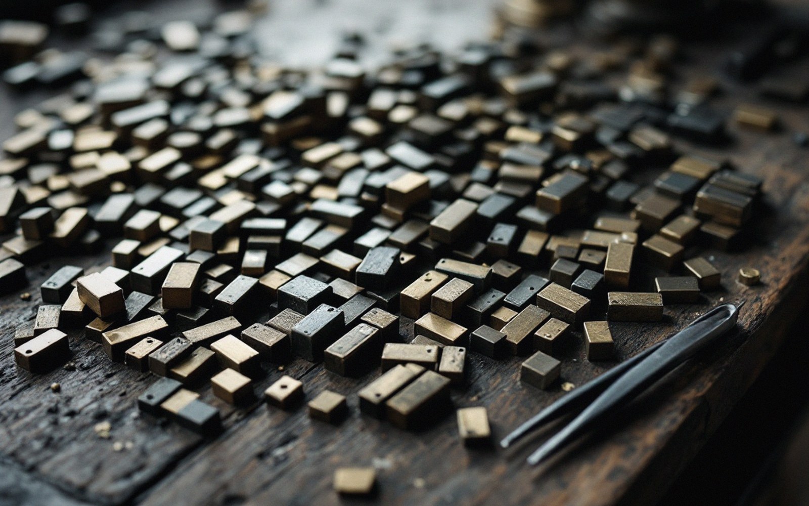
In hand composition, a space is not an absence — it is a piece of metal. Spaces and quads are cast to exact widths: the em quad, the en quad, the thick space (one-third of an em), the mid space (one-quarter), the thin space (one-fifth). Below these are hair spaces, slivers of type-metal barely thicker than card. The compositor reaches for all of them, and the choice of which to use last is the whole art of justification.
The composing stick is set to a fixed measure before the first letter drops in. Every line must fill that measure exactly — not approximately, not close enough. A line that is too loose will shift when the stick is tilted; a line that is too tight will spring a letter when the forme is lifted to the press. Either way, the print reveals it. Children working at a classroom case discover this early, usually by losing several letters onto the floor.
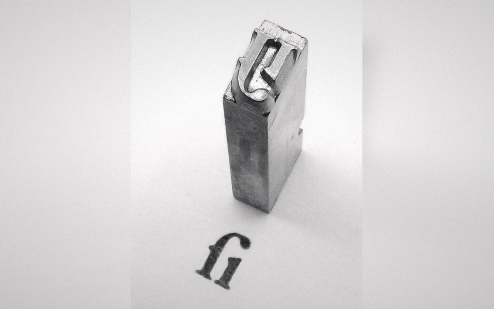
Justification works from coarse to fine. A compositor spaces out the words with mid spaces first, reads the remaining gap, and then adjusts — splitting a thick for a mid and a thin, or swapping a mid for a thin and adding a hair — until the line closes tight enough to resist a fingernail drawn across the face. The last piece often goes in with tweezers, angled in from above, because there is no gap wide enough to seat a finger. When it is right, the whole line holds as a single rigid bar.
Uneven word spacing is the most common failure. A line with three words and a long gap, followed by a line packed tight, reads as bad even when it prints cleanly — the eye stumbles before the meaning does. The discipline of justification trains the compositor to break words differently, to reconsider the line above, to trade a longer word for a shorter one if the class will allow it. Editing and spacing are not separate operations; in editing before setting, this is already the argument. The compositor's copy is a negotiation between what was written and what the measure will hold.
Heavy ink fills the counters of e and o first, which is why a pale proof is the safer error.
For a school newspaper set by children, the lesson is particular: the line is a public object. It will be inked, pressed, multiplied, and sent somewhere. Sloppiness in spacing becomes sloppiness in every copy. The tweezers are not a detail — they are the last step in a sequence of decisions that began with the choice of words.