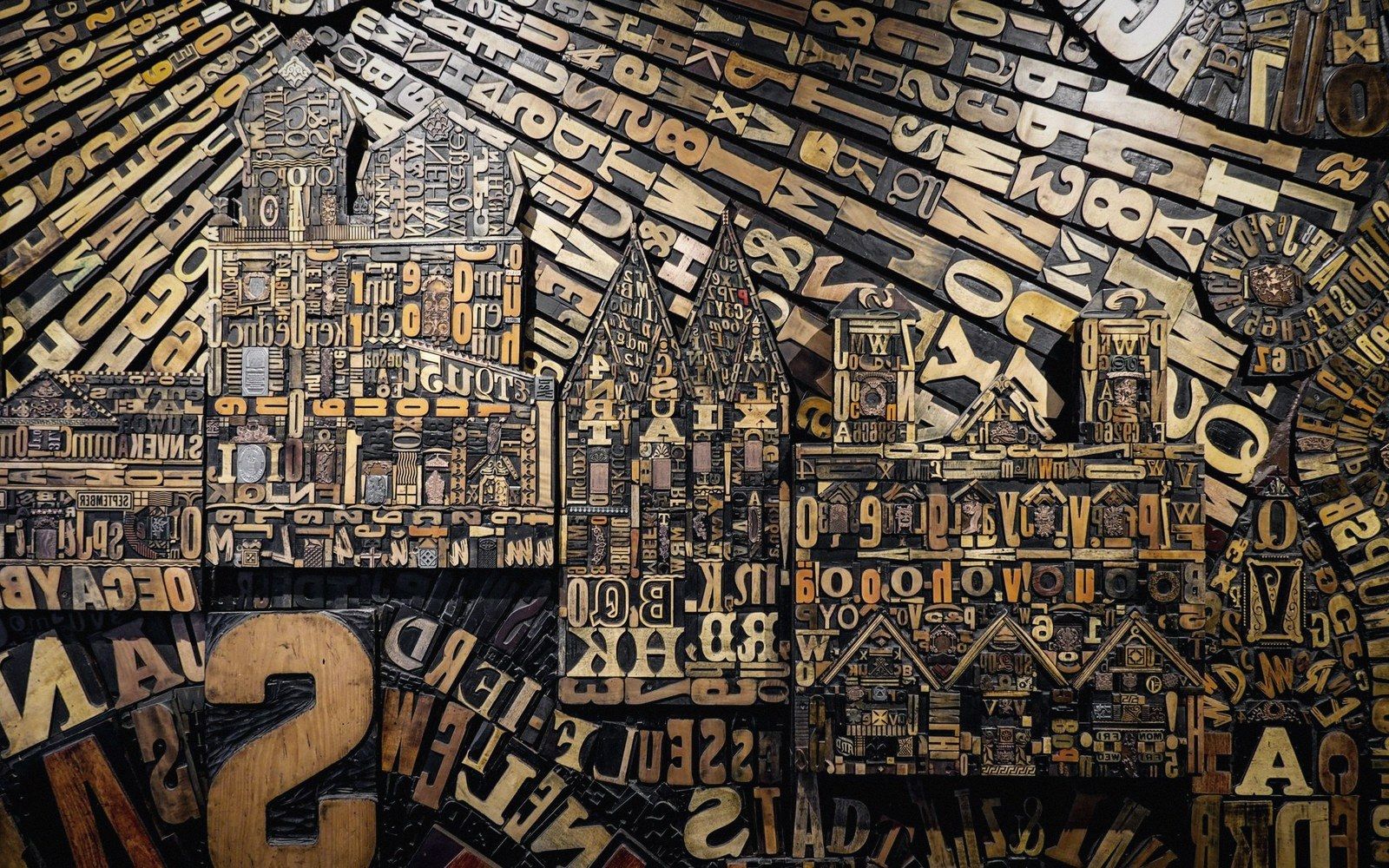
A type case looks, at first glance, like an arbitrary grid of small wooden boxes. Look again, and it is an argument about language — a sorting of the alphabet by how often each letter appears in the prose that will be set from it. The compositor who designed the layout was not filing for retrieval; he was filing for speed, and speed in the composing room means the hand travels the shortest distance to the letters it needs most.
The traditional California job case, which became standard across much of the English-speaking world, places the lowercase letters in the lower right portion of a single shallow tray, with capitals in the upper left. Within that lowercase field, the most common letters sit near the centre — close to where the hand hovers when the stick is in the other hand. The e box is large and central; so is the box for t, for a, for i, for o. Less frequent letters migrate toward the edges. Z, q, x get the far corners: small boxes, seldom visited, and the journey to reach them is itself a small penalty that makes the compositor think twice before using them.
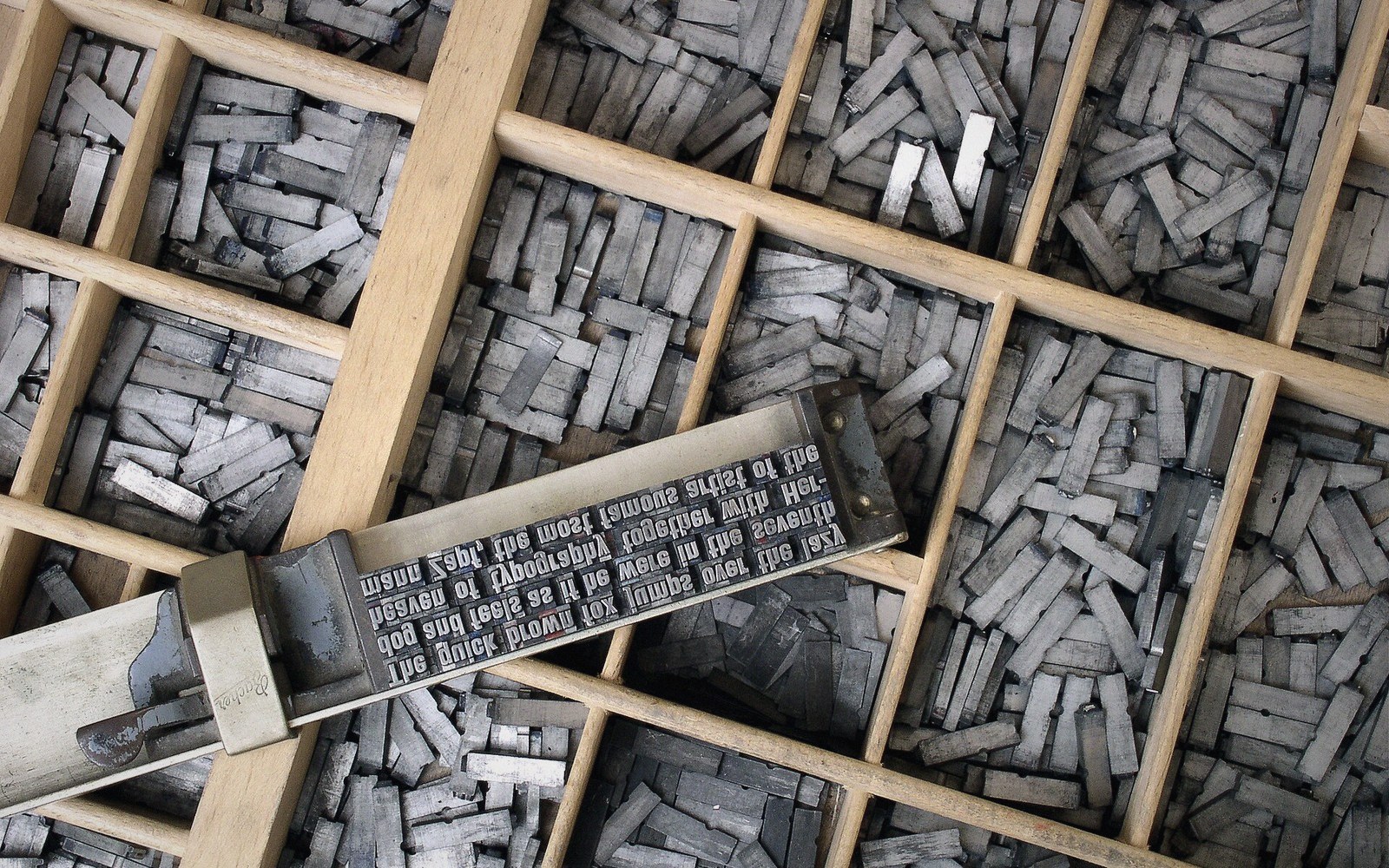
Wear as evidence
An old case tells you everything. The boxes that held the most-used sorts will be rubbed smooth along their front edges where fingers reached in thousands of times; the wood is sometimes almost polished, a finish no craftsman applied. The boxes in the corners stay rough. If you come across a case in a school storeroom or a printer's archive, you can read the wear before you read the label.
In a classroom press, the evidence is often sharper than in a professional shop — and more specific. School type was typically a single face in a single size, a modest quantity purchased once and used until it was exhausted. Whatever language the children wrote in, the wear pattern in the case would drift toward that language's particular frequency curve. A case used for decades in a French classroom would show heavy wear on the e, the s, the a and the n — among the most common letters in written French. An English classroom would show a similar e, but a heavier t and a notably worn h, because the digraph th appears in English at a rate that French orthography does not approach.
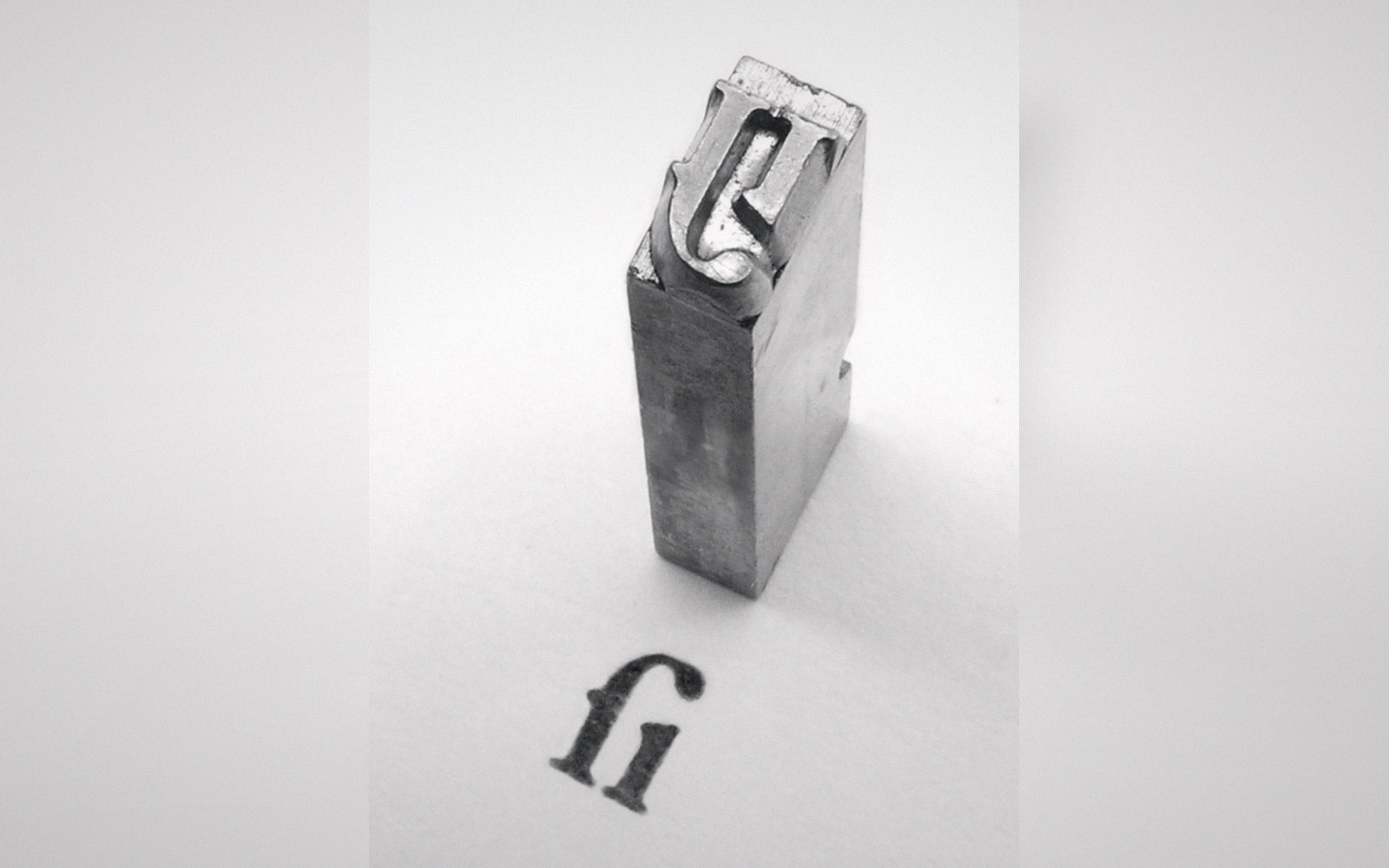
A box that empties mid-sentence ends the sentence — the case holds a finite number of every letter.
Photo: Garamond type ſi-ligature 2 · Wikimedia CommonsThis is why sorts run out in the specific way they do. The case was stocked in proportion to frequency — more es cast than zs — but a run of text that is richer than usual in a particular letter will drain that box long before the others. The mismatch between the stocked quantity and the actual demand of a given text is the practical problem that frequency-based layout was designed to minimise, not eliminate.
The case as a working document
The order of the case is also a teaching instrument, though not a gentle one. A child setting type for the first time has to learn not an alphabet but a map — a spatial arrangement that makes no sense until the hand has been to each box enough times to know it without looking. The letters are not where you would put them if you were thinking about spelling. They are where they are because of statistics, and the only way to internalise that map is repetition.
A case worn by years of school use is a record of what was written in that room. The boxes document the choices, the words, the sentences that were composed and corrected and set and printed, then put back into those same compartments. Nothing in the room accumulated that history more quietly, or preserved it more faithfully, than the wood beneath the type.