
The one piece of type that never went back in the case
Every other element of a school newspaper was set fresh for each issue — the texts chosen, argued over, composed letter by letter in the stick, locked up and eventually distributed back into the case. The masthead was the exception. Cut once in wood or linoleum, or occasionally cast as a single unit of metal, it lived outside the type case entirely, wrapped in a rag, stored on a shelf, brought out each time the press ran and returned to its place unchanged.
The image — usually the school's name, sometimes a rough device showing the village, a hand, a press, a cockerel — was cut by the class or by the teacher in the first weeks after the press arrived. The quality varied enormously. Some mastheads were crude, the gouge slipping, the lettering uneven. Others were careful and proud, the sort of thing a child re-cut after the first attempt because the first attempt was not good enough. Either way, the result was fixed. To change the masthead was to change the paper's identity, and classes rarely did it.
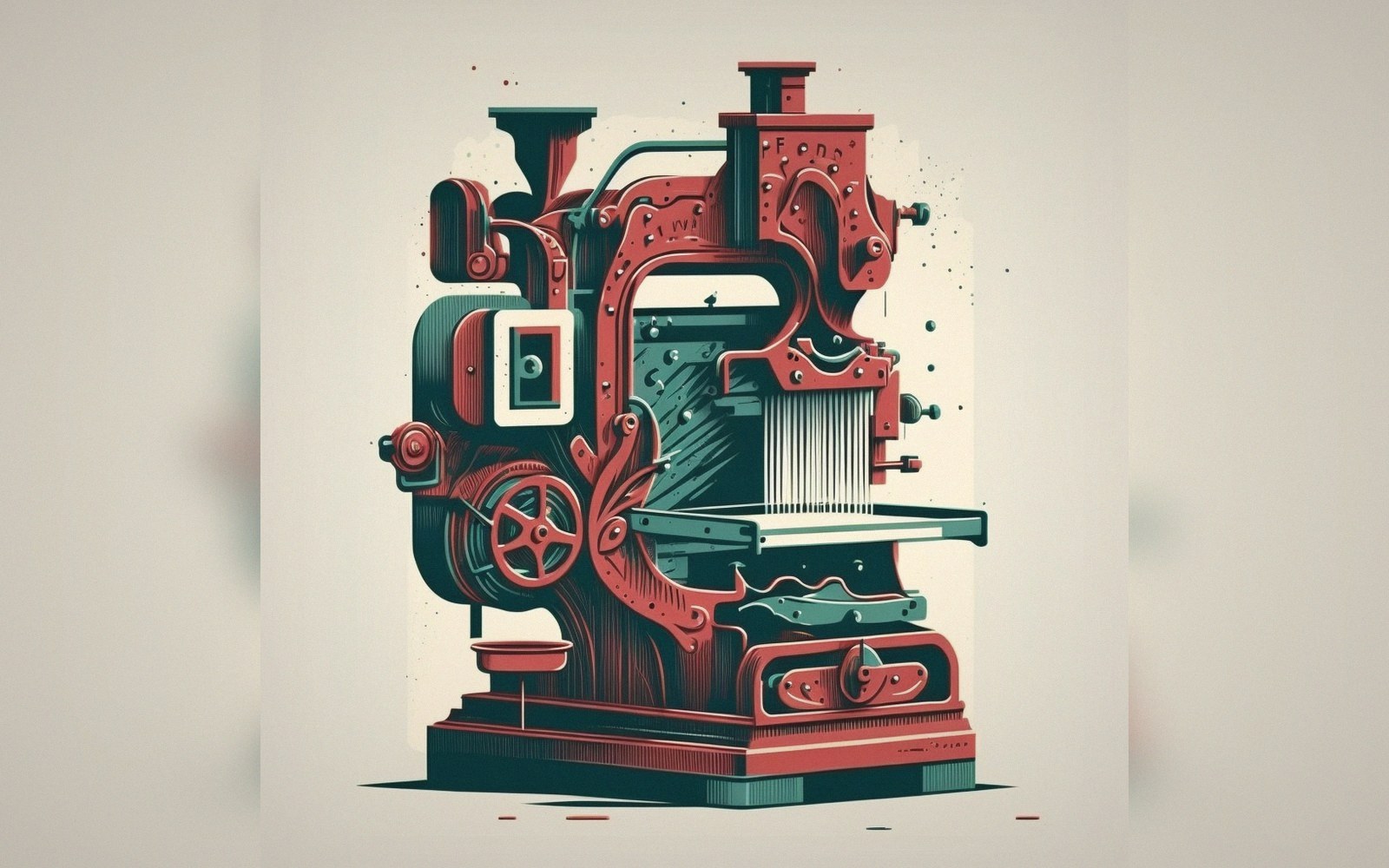
What the masthead supplied was continuity. Each printed sheet was otherwise entirely temporary — ephemeral by design, kept by accident, made to travel. The masthead told any reader, near or far, which school this came from and what the publication called itself. On the exchange networks where schools posted papers to one another across considerable distances, the masthead was the first thing a recipient looked at: it identified the correspondent. A worn block, its finest lines beginning to fill, is sometimes now the most legible evidence that a particular school pressed at all.
Linocut was the common medium because lino cut easily, cost almost nothing, and held detail well enough for a title at display size. The block mounted type-high on a wooden base and sat in the forme alongside the text, locked up with everything else, printed in the same pull. That integration — image and text sharing one impression — was not incidental. It made the masthead part of the press's logic rather than a separate act of design.
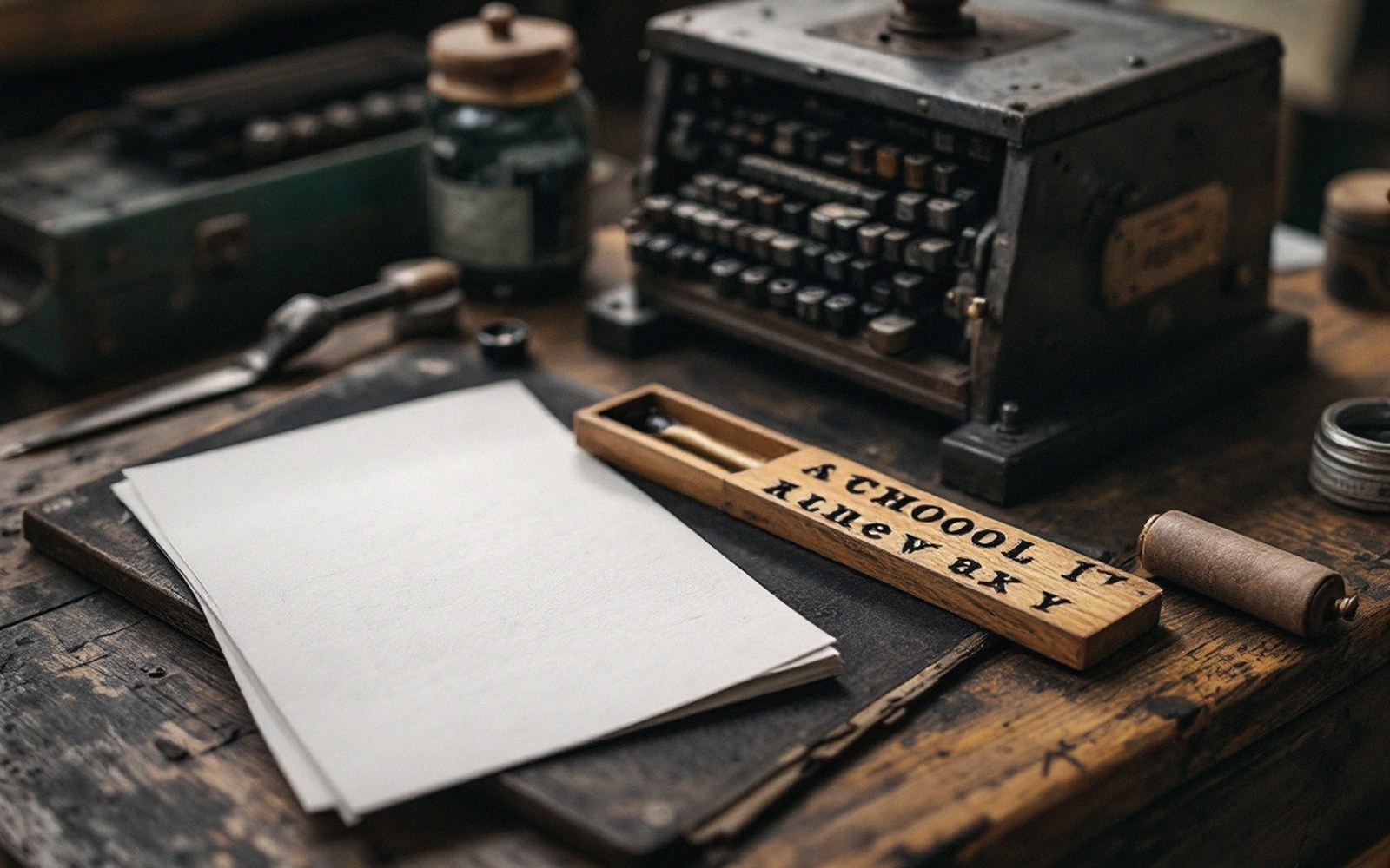
Heavy ink fills the counters of e and o first, which is why a pale proof is the safer error.